Mastering Responsive Web Coding: Must-Know Techniques for Adaptive Designs
Introduction to Responsive web coding in 2024
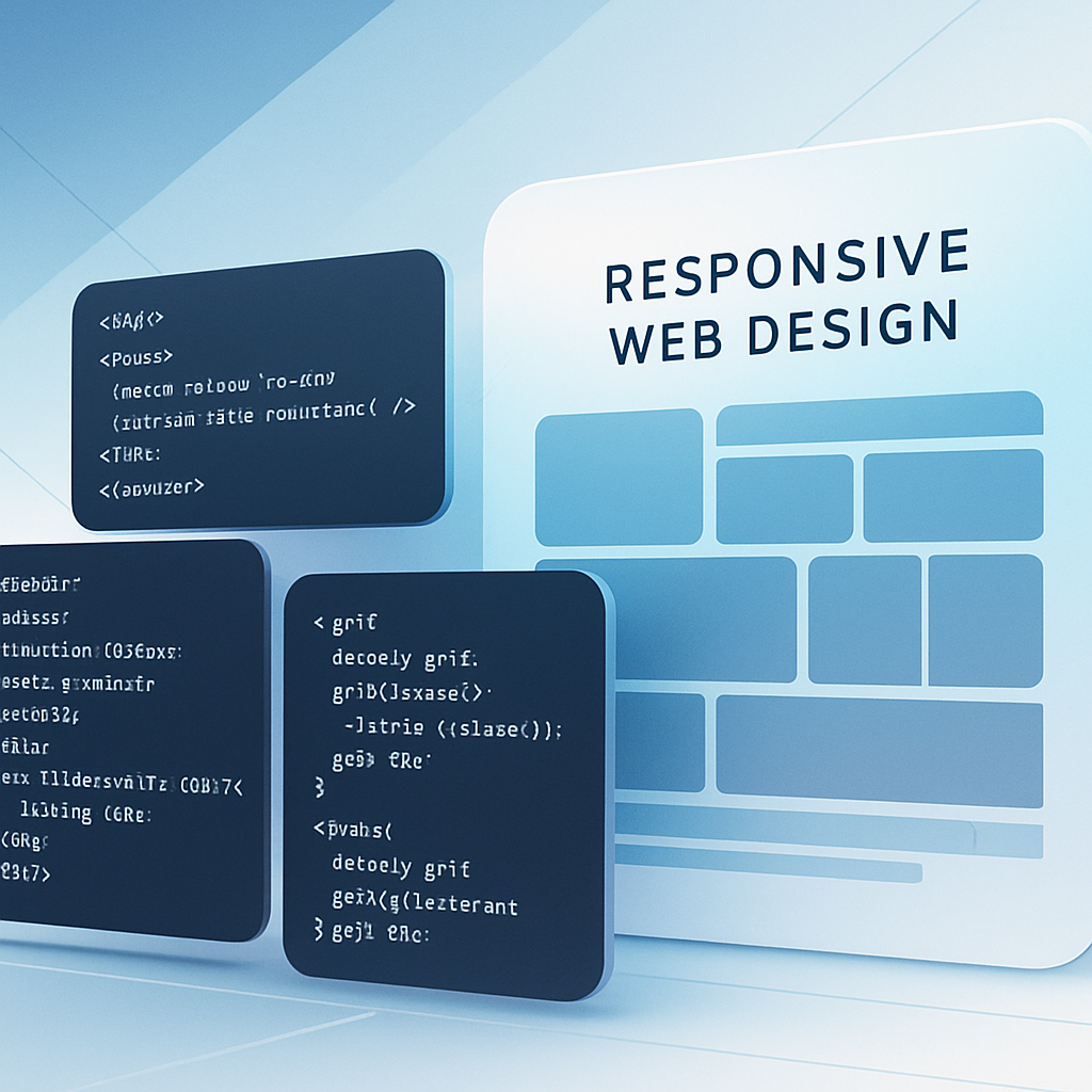
As digital landscapes evolve, responsive web coding has become a foundational skill for developers and designers alike. The ability to create fluid, adaptive designs that offer consistent user experiences—regardless of screen size or device type—is no longer optional but imperative.
In 2024, the focus on truly seamless responsiveness extends beyond simple media queries and static breakpoints. Developers are adopting dynamic, flexible techniques that anticipate user context and device capabilities, resulting in websites that feel intuitive and natural.
Understanding Fluid Grids and Flexible Layouts
Central to responsive web coding is the adoption of fluid grids. Unlike fixed pixel-based layouts, fluid grids use relative units such as percentages, em, and rem to adapt the content and structure proportionally to the viewport.
For example, defining a container's width as 80% rather than a fixed 960px ensures that the layout scales smoothly across different devices. Combining this approach with modern CSS layout models like CSS Grid and Flexbox creates flexible, robust structures that dynamically rearrange components.
Practical Tip:
Leverage minmax() in CSS Grid to define grid tracks that maintain minimum and maximum sizes, which improves adaptability for a variety of screen sizes. For example:
grid-template-columns: repeat(auto-fit, minmax(200px, 1fr));This assigns grid columns that are at least 200px wide but grow to fill the remaining space, enabling graceful scaling for many layouts.
Advanced Media Queries and Container Queries
Traditional media queries bound design changes to viewport widths, but 2024's best practices incorporate container queries, an emerging CSS feature allowing styles based on an element's container size rather than the entire viewport.
This granular control lets components adapt independently within complex layouts, fostering modular design principles and improving responsiveness. For instance, a card component within a sidebar might adjust its layout differently based on the container size, regardless of overall screen width.
In parallel, media queries have become more granular and contextual, considering device orientation, resolution, user preferences (e.g., prefers-reduced-motion), and input methods (touch vs. pointer).
Example:
@container (min-width: 400px) {
  .card {
    flex-direction: row;
  }
}
Implementing Responsive Typography and Media
Typography and media elements (images, videos) play a pivotal role in fluid design. Using responsive typography approaches like clamp() allows font sizes to scale naturally between a minimum, preferred viewport-based size, and a maximum.
font-size: clamp(1rem, 2vw + 0.5rem, 2.5rem);This formula ensures text remains legible on small devices while growing appropriately on larger screens without overwhelming the layout.
For images and video, the srcset and picture elements enable serving optimized media depending on device resolution and size, reducing load time and improving performance.
Progressive Enhancement and Accessibility Considerations
Mastering responsive web coding is incomplete without a focus on progressive enhancement and accessibility. Ensuring your code delivers core functionality and content to all users, regardless of browser capabilities, creates an inclusive digital experience.
Use semantic HTML, ARIA attributes, and keyboard navigability to support users with disabilities. Combine these practices with responsive techniques so content remains readable and navigable on all devices, including screen readers and assistive technologies.
JavaScript Enhancements for Responsive Behavior
While CSS handles most layout adaptations, JavaScript is invaluable for fine-tuning responsiveness beyond style. It can detect device features, manage lazy loading, trigger animations conditionally, or alter component behavior (e.g., navigation menus) depending on screen size.
For example, dynamically loading a lightweight mobile menu script only on small devices improves performance while maintaining rich interactions on desktops.
Emerging Trends: Container Queries and CSS Subgrid
Looking beyond basics, CSS Subgrid introduces the ability to share grid definitions between parent and child elements, enhancing layout consistency across nested components. Combined with container queries, this empowers truly modular, adaptive interfaces.
Meanwhile, improved browser support for container queries is transforming how complex responsive patterns are implemented, reducing the need for brittle CSS hacks and overly complex JavaScript fallbacks.
Practical Example: Responsive Web Page Skeleton
<section class="grid-container" style="display:grid; grid-template-columns: repeat(auto-fit, minmax(250px, 1fr)); gap: 1em;">
  <article class="card" style="border: 1px solid #ccc; padding: 1em;">
    <h2>Fluid Layout</h2>
    <p>Scales gracefully with screen size.</p>
  </article>
  <article class="card">
    <h2>Responsive Typography</h2>
    <p style="font-size: clamp(1rem, 2vw + 0.5rem, 2rem);">Text adjusts fluidly.</p>
  </article>
  <article class="card">
    <h2>Adaptability</h2>
    <p>Supports container queries and JavaScript control.</p>
  </article>
</section>
Conclusion: Crafting Adaptive Experiences in 2024
Mastering responsive web coding is a nuanced combination of embracing fluid layouts, leveraging advanced CSS capabilities like container queries, and integrating JavaScript strategically. By focusing on flexible grids, responsive typography, optimized media, and accessibility, developers can create adaptive designs that thrive in 2024 and beyond.
This evolving landscape challenges us to rethink responsiveness not just as a checklist, but as a continuous, context-aware process that respects user environment and device capabilities, ultimately delivering meaningful, engaging experiences to all visitors on any device.